After I posted Washington’s Summer of Smoke, a reader on X asked a great question: the hour-by-hour plume is easy to follow, but did I compare it with ground-level PM2.5 readings? Where did the model and the local monitors agree, and where did they differ?
I hadn’t. The animation is all NOAA’s HRRR-Smoke model, and the post said so. So here’s the comparison: the model against every Washington air-quality monitor with enough data, for the same seven weeks, July 25 to September 10.
PM2.5 monitors
compared
model also called smoky
a factor of 2
The short answer
The model was good at which days were smoky and where. Of the 276 monitor-days that reached “Unhealthy for Sensitive Groups” or worse (a 24-hour average of 35.5 µg/m³ or more), the model also had 226 of them over the line. It missed 50, and it called 63 smoky days the monitors didn’t see. On the smoky days, its number was within a factor of two of the monitor’s about three times out of four.
How much smoke is where it drifted, and the pattern makes sense once you see it on a map: too heavy close to fresh fires, too light in narrow valleys.
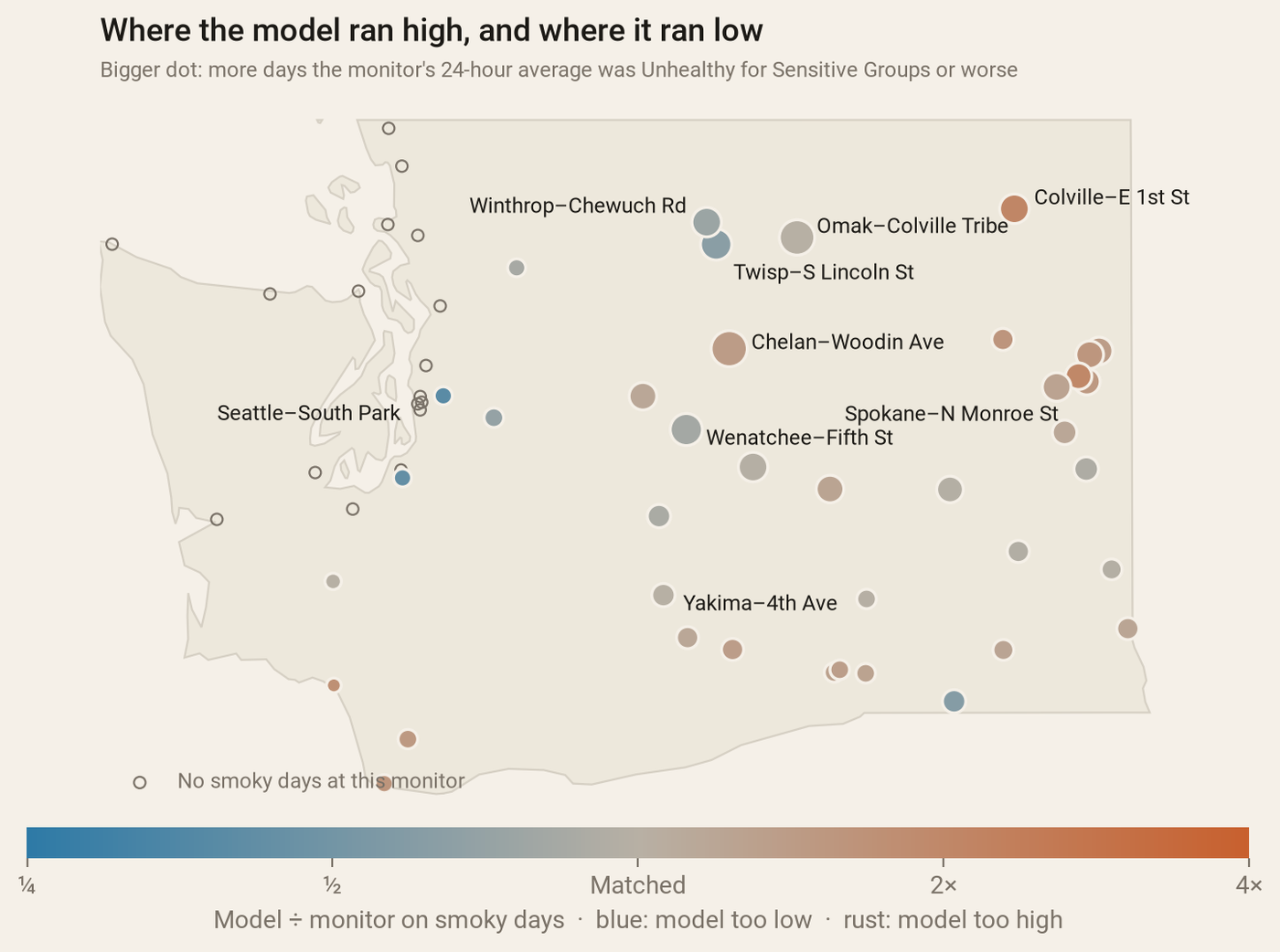
Each dot is a monitor. Colour: the model’s smoke divided by the monitor’s, on the days either one called smoky. Size: how many smoky days the monitor saw.
Where they agreed
Central Washington, mostly. Yakima, Toppenish, Ellensburg, Ritzville and the Tri-Cities line up closely day by day, with daily correlations of 0.84 to 0.97 (1.0 would be a perfect match). As a region, the model’s smoky-day average was within a couple of percent of the monitors’.
It also got the big picture right. The worst stretch of the summer was August 4–6: on August 5, 36 of the 54 Washington monitors reporting that day were over the line. The model has the same days: on August 4, 5 and 6 it put 34, 33 and 29 monitors over the line, against 32, 36 and 35 on the ground.
Where the model ran high: Spokane, right after the fires started
The Spokane Complex fires broke out on August 1. In the animation, the darkest smoke of the whole summer sits over Spokane on August 2. The monitors saw something lighter, and a day later. At Spokane’s North Monroe Street monitor, the model’s 24-hour average for August 2 was about 300 µg/m³; the monitor averaged 58. On August 3 the monitor peaked at 100, its worst day, and the model had come down to 134. That matches what the Spokesman-Review reported at the time: August 3 was the city’s worst air.
Colville showed the same thing at the start of the window: the model put about 195 there on July 26 against 38 on the ground. Across Spokane and the northeast, the model called every smoky day the monitors saw but one in 25, and on those days ran about 40% heavy. Close to a big new fire, the model’s estimate of how much smoke the fire is putting out does a lot of work, and early on it seems to have guessed high.
Where it ran low: the Methow, and Seattle’s one smoky day
Twisp and Winthrop, in the Methow valley, are the blue dots. Twisp had 14 smoky days; the model caught 6. On August 9 the Twisp monitor averaged 100 and the model 27. Narrow valleys trap smoke under cool night air, and at 3 km the model doesn’t have the valley. Wenatchee had the worst single day of any monitor, 198 on August 4. The model had the day but at about half that, near 100.
The west side surprised me. In the first post I wrote that Seattle mostly stayed blue, and it did: Seattle’s South Park monitor had just one smoky day all summer. But that day was August 6, at 36, in the statewide worst week, and the model had only about 6. The model did bring some haze west that week, just lighter, and cleared it out a day or two early.
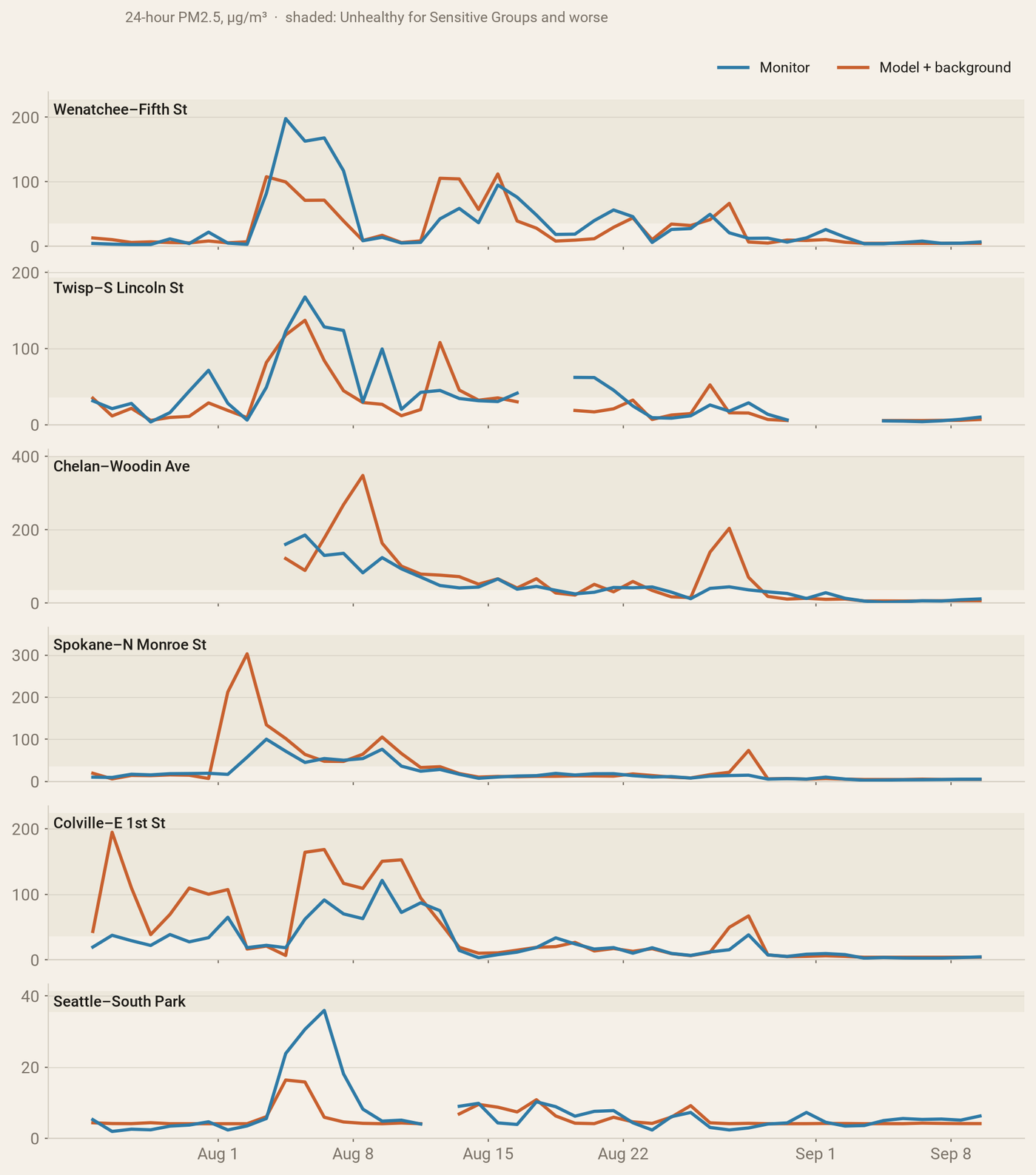
Daily averages at six monitors. Blue is the monitor; rust is the model plus the everyday background. Shading is “Unhealthy for Sensitive Groups” and worse.
Chelan and Omak are mixed: some days close, a few big misses in timing. Chelan’s worst day was August 5 (186 on the monitor, 89 in the model); the model’s was August 8 (348, against 83). Those are the monitors closest to the north-central fires, where a small shift in the wind moves a thick plume on or off a town.
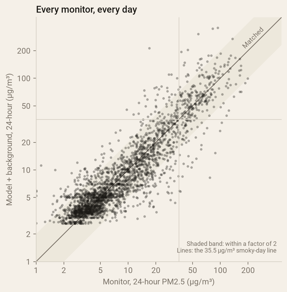
Every monitor, every day. Dots on the diagonal are a perfect match; the shaded band is within a factor of two.
How I compared them
- The monitors. AirNow, the EPA’s real-time air-quality system, publishes every state, tribal and federal monitor’s hourly reading, including the temporary smoke monitors set up near big fires. These are the real-time numbers, before the agencies’ final quality checks. A GitHub Action read the 1,152 hourly files for the window and kept the Washington PM2.5 readings.
- Matching them up. The model is read at the 3 km grid cell holding each monitor, and averaged to match the monitor’s hour.
- Smoke versus everything. A monitor measures all fine particles; HRRR-Smoke is smoke only. So each monitor gets its everyday background, the typical reading when the model had no smoke there (usually 3 to 6 µg/m³), added to the model before comparing.
- Days, not hours. The EPA’s health categories are for 24-hour averages, so the comparison is too: Pacific days, with at least 18 hours reported.
Last thing
Thank you to the reader who asked. It made the original project better, and I learned where to trust the model and where to check a monitor. If you were near Spokane or in the Methow this summer, the monitors are the ones that were measuring the air you actually breathed.
Data: AirNow hourly PM2.5 (U.S. EPA and its state, tribal and federal partners; preliminary, not yet validated); NOAA HRRR-Smoke via the NOAA Open Data Dissemination program. Spokane’s worst-air date: The Spokesman-Review. The comparison script is in the wa-smoke project.
Go deeper
For the Methow Valley, wildfire smoke has created a ‘fifth’ season — Soundside (KUOW), 20 July 2022, about 51 min. A whole special from the valley where Twisp and Winthrop sit, with Clean Air Methow, Twisp’s mayor and UW’s Joel Kaufman.
The Science Of Wildfire Smoke — Short Wave (NPR), 26 August 2020, about 14 min. NOAA’s Jessica Gilman on PM2.5 and why smoke lands so far from the fire.
Ye, X., Arab, P., Ahmadov, R. et al. (2021). Evaluation and intercomparison of wildfire smoke forecasts from multiple modeling systems for the 2019 Williams Flats fire. Atmospheric Chemistry and Physics 21, 14427–14469. Open access.
Chow, F.K., Yu, K.A., Young, A., James, E., Grell, G.A., Csiszar, I., Tsidulko, M., Freitas, S., Pereira, G., Giglio, L., Friberg, M.D. & Ahmadov, R. (2022). High-resolution smoke forecasting for the 2018 Camp Fire in California. Bulletin of the American Meteorological Society 103(6), E1531–E1552.
Barkjohn, K.K., Gantt, B. & Clements, A.L. (2021). Development and application of a United States-wide correction for PM2.5 data collected with the PurpleAir sensor. Atmospheric Measurement Techniques 14, 4617–4637. Open access.
From PurpleAir to AirNow, Your Air Quality Maps for Wildfire Smoke — KQED Science; a clear guide to which map is measuring what.
Expanding air monitoring for the 2024 wildfire season — Washington Ecology, 2024; how the state drops portable smoke monitors near big fires.
New Report Examines How Methow Valley Tracks Wildfire Smoke and Protects Residents — American Lung Association, 2026; a community sensor network that caught the valley’s nighttime inversions.
AirNow — EPA’s real-time air-quality system. · AirNow API — the data feeds and file products. · AirNow Fire and Smoke Map — monitors, temporary smoke monitors and corrected sensors together.
AirQualityWA — Washington Ecology’s monitor map. · Washington Smoke Blog — daily smoke outlooks from the state, counties, federal agencies and Tribes.
HRRR-Smoke graphics — the model side of the comparison. · NOAA HRRR on AWS — the archive. · wa-smoke — this project’s code.