Yesterday’s map was the heat dome, the week in 2021 when Seattle hit 108. This one is the other half of a Northwest summer, and it’s this year’s: seven weeks of fire and smoke across Washington, from late July into September 2026, one hour at a time.
It’s a different kind of map to make. The heat dome was a strange week that people tell stories about. This summer is still going on for a lot of families, especially around Spokane, and I’ve tried to keep that in mind.
Washington, July 25 – September 10, 2026 · near-surface smoke, NOAA HRRR-Smoke (3 km, hourly) · fires detected by NASA VIIRS · fire perimeters from NIFC · USGS 3DEP terrain · rendered with forge3d
by late August
Spokane Complex
around Spokane
failing federal standards
What you’re watching
- The haze is wildfire smoke near the ground — the air people were breathing — from NOAA’s HRRR-Smoke model. Light smoke is pale grey; thick smoke goes brown.
- The orange glow is fire seen by satellite. The VIIRS instruments on three polar-orbiting satellites pass over twice a day and flag every 375-metre pixel that’s burning. Each detection glows for twelve hours, then leaves a dark burn scar, so you can watch the fires grow night by night.
- The city numbers are smoke in micrograms per cubic metre, coloured by the EPA’s Air Quality Index categories: green is good, red is unhealthy, purple and maroon are very unhealthy and hazardous.
- At the end, the camera holds while the official fire perimeters are traced in.
The north-central fires
When the video starts, the Okanogan and Chelan country is already burning. Little Giant had started on July 16; Sinlahekin was a lightning strike in the Sinlahekin Valley west of Tonasket on July 26. Watch the plumes: day after day they peel off the fire fronts and stream east across the Columbia Basin. By the time their perimeters were last mapped, Little Giant had grown to about 173,000 acres, Sinlahekin to 166,000, and Kaiser Canyon to 138,000.
August 1, Spokane
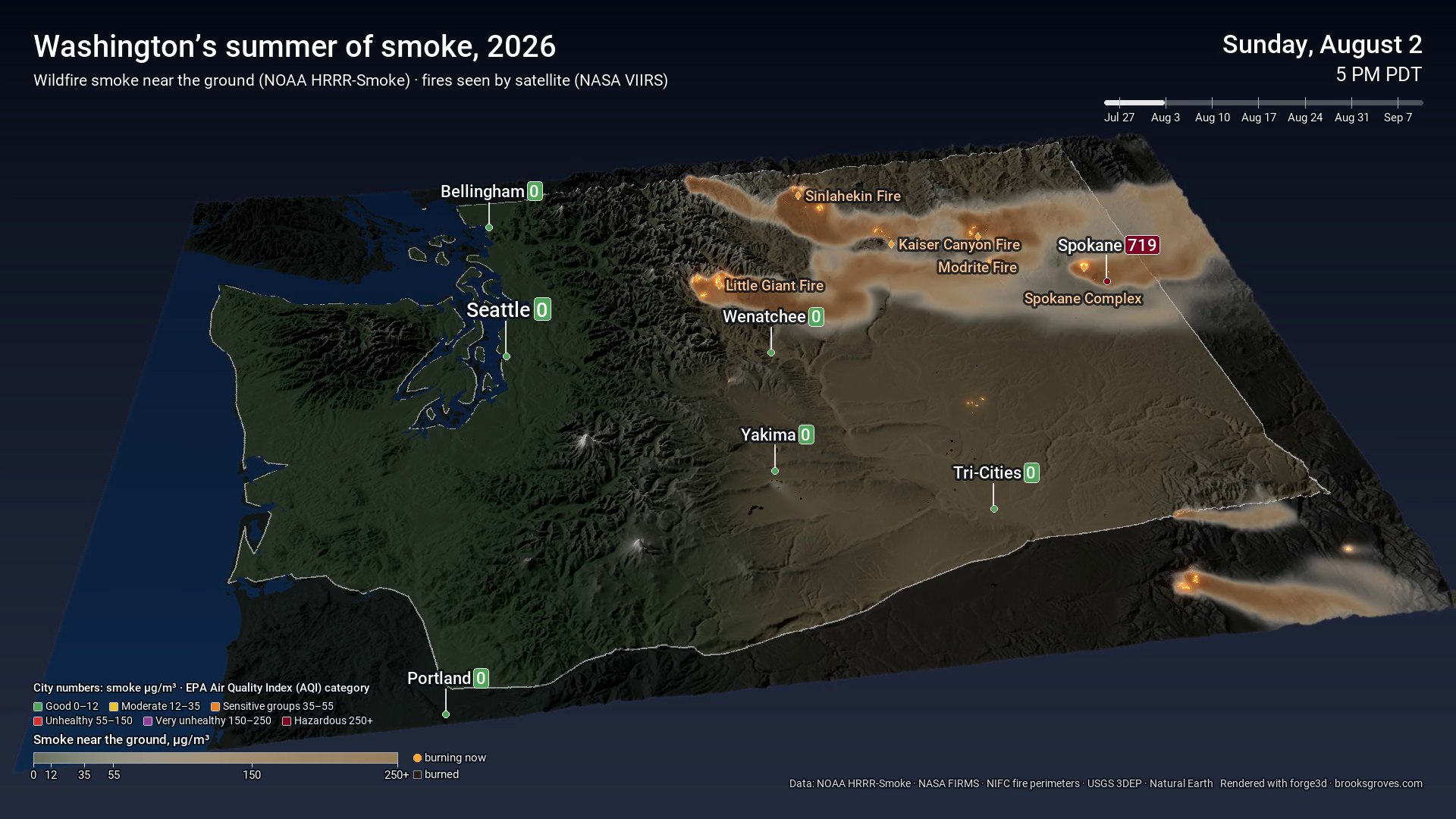
Sunday, August 2, 5 PM · the day after the Spokane Complex fires started. The model has 719 µg/m³ over Spokane. Seattle: 0.
On August 1 three fires broke out on the edges of Spokane — Old Trails, Autumn Lane and Fairview, together the Spokane Complex. They burned nearly 10,000 acres, forced 65,000 people to evacuate, and destroyed more than 830 homes. In the video it’s a small fire next to the big ones up north. On the ground it was devastating.
The smoke over the city that first weekend is the darkest thing in the whole video. The Spokesman-Review reported that August 3 was the worst air of the month, and that by mid-August Spokane had gone eleven straight days without air meeting federal standards.
Why Seattle stayed blue
Watch the left side of the map. For most of the summer, Seattle, Bellingham and Portland sit at or near zero while the east side is buried. Onshore winds off the Pacific kept most of the smoke east of the Cascades. In the model, the west side gets a few hazy days in late August, when smoke finally spills through the passes, and that’s about it.
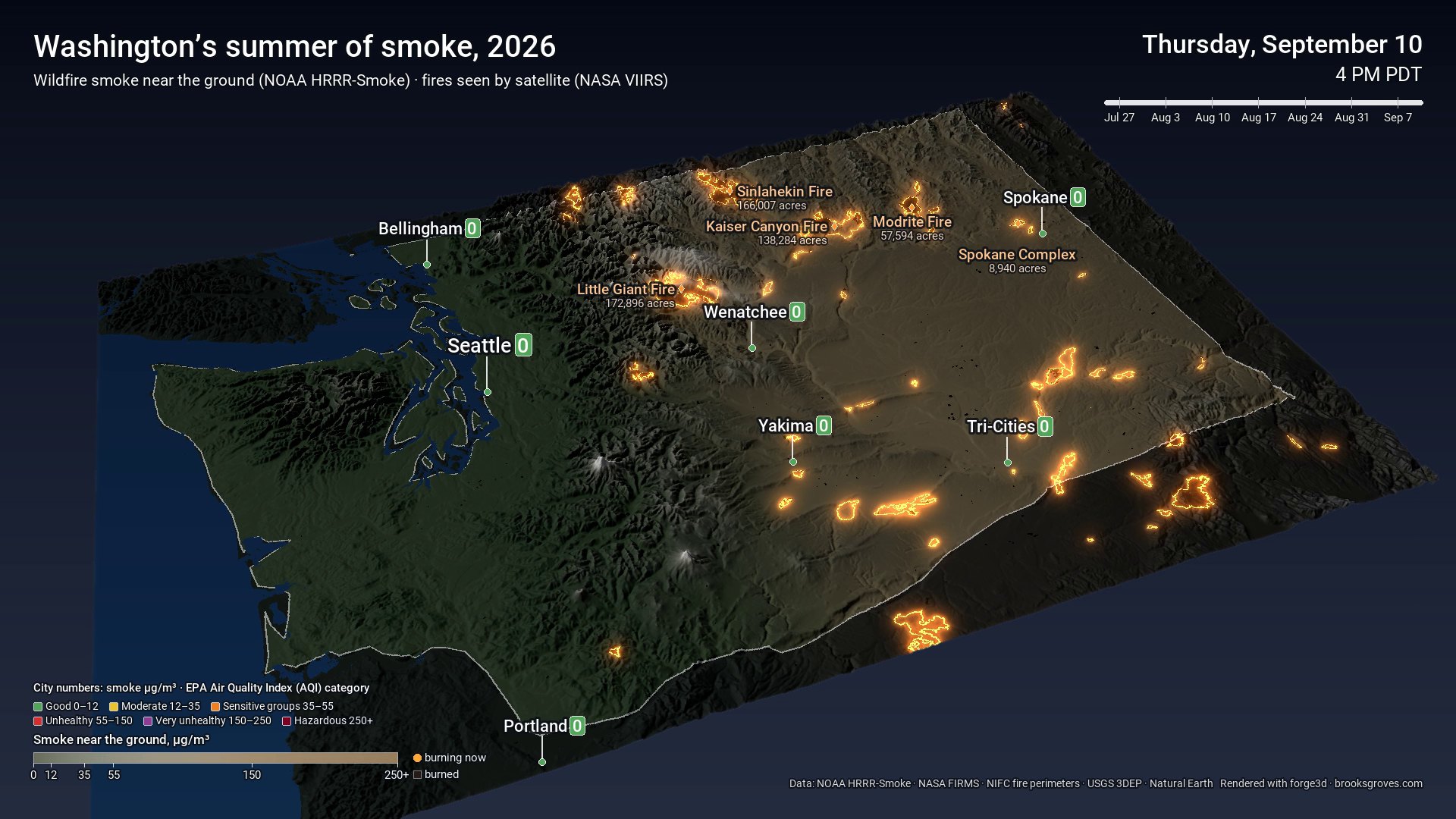
The final frame: every mapped perimeter of 1,000+ acres, with the largest Washington fires labelled.
How it’s built
Same toolkit as the heat dome, with two new ingredients. Credit again to Milos Popovic, whose wildfire smoke animations started this, and whose forge3d draws the terrain.
- Smoke. NOAA runs HRRR every hour on a 3 km grid with a smoke tracer fed by satellite fire observations. The files live in NOAA’s open-data bucket on AWS at about 150 MB each, but each comes with an index, so the script downloads just the byte range holding near-surface smoke — 1,152 hours in about seven minutes.
- Fire. 133,866 satellite fire detections from NASA FIRMS, and the official perimeters from the National Interagency Fire Center.
- Two renders a frame. The 3D viewer lights everything it draws, which made smoke look like paint on the hills. So each frame is rendered twice: once for the land and fires, and once for the smoke alone, colour-coded red-for-smoke, blue-for-none. Lighting scales red and blue together, so the ratio survives, and the finishing script reads the smoke back from it and lays it over the land as a veil — haze in the air rather than on the ground.
HRRR-Smoke is a model, not a network of monitors. It’s good at where the smoke goes and roughly how thick it is, but the hourly number on a city won’t match that city’s air-quality monitor exactly, and the EPA’s official categories are based on 24-hour averages. Treat the colours as a guide, not a reading.
Last thing
Behind every one of those orange outlines are crews who worked it and people who waited for news about a house. If you were evacuated this summer, or you’re still rebuilding, I hope the fall is kinder.
Data: NOAA HRRR-Smoke via the NOAA Open Data Dissemination program; NASA FIRMS VIIRS active fire detections; NIFC WFIGS Interagency Fire Perimeters; USGS 3D Elevation Program; Natural Earth. Facts: Axios, The Spokesman-Review, Wikipedia. Rendering: forge3d by Milos Popovic. Labels: Roboto.