I started this project with a simple question and a ruler. For every wildfire on the West Coast this year, how far is it to the nearest fire station?
I expected the answer to be a map of gaps: places where fire burns and nobody is close. I found one. Then I found out who lives in it.
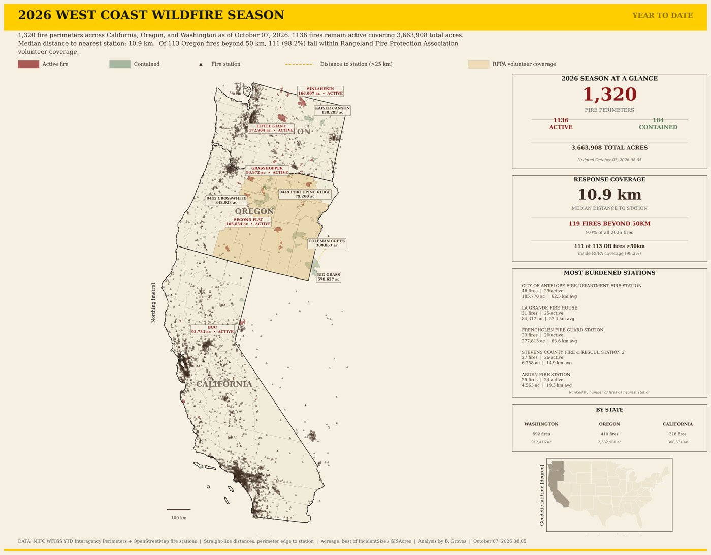
The 2026 season through October 7: 1,320 fire perimeters across California, Oregon and Washington. The tan counties are the ones where Oregon’s rangeland volunteers work, drawn generously.
Measuring the distance
Early every morning, the page downloads the year’s fire perimeters from the National Interagency Fire Center for the three West Coast states. Once a month it pulls every fire station mapped in OpenStreetMap. Then, for each fire, it measures the straight-line distance from the edge of the burn to the closest station.
So far this year that’s 1,320 fire perimeters and about 3.66 million acres. The typical fire was just 10.9 km from a mapped station, closer than you might guess. Most fires start near people, roads and towns, and that’s where the stations are.
But the states don’t look alike:
- Washington: 592 fires, typically 8.3 km from a station. Fewer than 1 in 100 were more than 50 km away.
- California: 318 fires, also typically 8.3 km. Only one was beyond 50 km.
- Oregon: 410 fires, typically 22.5 km from a station, and 113 of them, more than a quarter, beyond 50 km. Oregon also had the most burned ground of the three: about 2.38 million acres.
Fifty kilometres is a long way when a fire is running through dry sagebrush. On the map, eastern Oregon looks like a hole in the safety net.
Then I looked at who’s out there
Eastern Oregon is enormous, open rangeland with very few people in it. Traditional fire protection follows people, and the people aren’t out there. Malheur County alone is bigger than the state of New Hampshire.
The ranchers are, though. Oregon has Rangeland Fire Protection Associations, or RFPAs: groups of landowners, ranchers, farmers and neighbours who are trained, equipped and legally authorized under Oregon law to fight fire on private and state land that no fire district covers. In 2025, Oregon’s 28 RFPAs provided first response on 17.7 million acres, with 1,284 volunteers and 870 pieces of firefighting equipment, and answered 290 fires.
They’re often the closest people to a new fire, because they live and work right there. They show up in pickups with water tanks on the back, and they know every draw, fence line and two-track on the ground they’re protecting. When the nearest station is two hours away, a neighbour who can be there in twenty minutes is the difference between a fire caught small and a fire that runs for days.
So I laid the counties where RFPAs work over the map, and asked a second question: of those 113 Oregon fires beyond 50 km of a station, how many burned in a county where RFPAs operate?
111 of 113, counted by county. That’s 98%. (More on the “by county” part below.)
The “gap” on the traditional map isn’t empty. It’s the line between two different ways of protecting the land: fire districts where the towns are, and ranchers’ associations where the range is.
Where the fires find the stations
The page also ranks which stations sit nearest to the most fires. The top three this year are all in Oregon, and they say a lot about how far apart things are out there:
- City of Antelope Fire Department: nearest station to 46 fires, an average of 62.5 km away.
- La Grande Fire House: 31 fires, averaging 57.4 km.
- Frenchglen Fire Guard Station: 29 fires covering nearly 278,000 acres, averaging 63.6 km. Frenchglen, in Harney County, is a town of just a few people at the foot of Steens Mountain.
For comparison, the busiest stations in Washington were nearest to a couple of dozen fires each, at an average of 15 to 20 km.
What the map can’t tell you
I’d rather list the caveats myself than have someone find them later.
- RFPA ground is drawn by county, and generously. Real RFPA boundaries follow land ownership and often cover only part of a county. The map shades 15 counties from older program lists, while the Oregon Department of Forestry’s June 2026 report puts today’s RFPAs across nine. So the true share is lower than 98%, and I’d like to redraw the map from the actual RFPA boundaries. The pattern is clear either way: Oregon’s far-from-a-station fires are out on the open range, the country these associations were made for.
- OpenStreetMap misses rural stations. Federal guard stations and small volunteer departments are often mapped differently or not at all. That makes the far-away count bigger than it really is. Eastern Oregon’s stations really are fewer and farther between; the gap is just smaller than the map shows.
- Distances are straight lines. Real response time runs on roads, and out there many roads are gravel. Every distance on the map is the best case.
- It counts perimeters, not ignitions. One fire can show up as more than one perimeter. And “active” just means the containment field is blank or under 100%, which for a lot of small fires never gets updated, so I don’t lean on that count.
The point
I grew up in the Sierra foothills, where fire season is just part of the year, and I’ve spent a lot of evenings with fire perimeter maps since. This project changed how I read them. A blank space on a map of fire stations doesn’t always mean nobody’s coming. Sometimes it means the help lives down the road and keeps a water tank in the truck.
Idaho and Nevada now have rangeland associations of their own, modelled on Oregon’s. If you’re one of those volunteers: thank you.
The map is open source at github.com/bdgroves/wildfire-response-gaps and live at brooksgroves.com/wildfire-response-gaps. It refreshes every morning.
Go deeper
Oregon Board of Forestry, June 2026: Rangeland Fire Protection Association budgets — the RFPA numbers quoted here, from 2025.
NIFC Open Data — the WFIGS fire perimeters behind every number. · OpenStreetMap fire stations — how stations are tagged, and why some are missed.
Census cartographic boundaries — the state and county lines. · The code — the whole pipeline.